Building A Dark Mode NPM Package
I’ve always been a light mode person. I like the cleanliness of it.
But I’ve recently developed a fascination with dark mode. It’s a feature which has been getting progressively more accepted into the internet development community. The following products went low light in the last couple years: apple, facebook, youtube, instagram, twitter, gmail, slack, soundcloud, google chrome. Here’s a convenient exhaustive list.
So I decided to add dark mode to one of my websites that I knew would get a lot of traction. It led me to wonder if there was a way to abstract the idea of dark mode out of the project and generalize it.
Thus was born a customizable, easy to implement dark mode toggle in React.
(If you don’t want to use any framworks and wish to work with vanilla HTML, CSS and JS, I’ve written a pure(ish) CSS version of the project as well.)
How I Decided The Default Palette#
The palette for dark mode is not as simple as inverting all the colors –– it’s very related to the fundamental idea of web app design.
Imagine your webpage as a surface from which items stick out at certain heights. In light mode, the elevation of an object is decided by the darkness and spread of the shadow that it drops. In dark mode, the elevation is decided by the colour of the object. The lighter the object the greater its elevation.
I didn’t use black as all –– the default background is the shade #121212, also known as very dark grey.
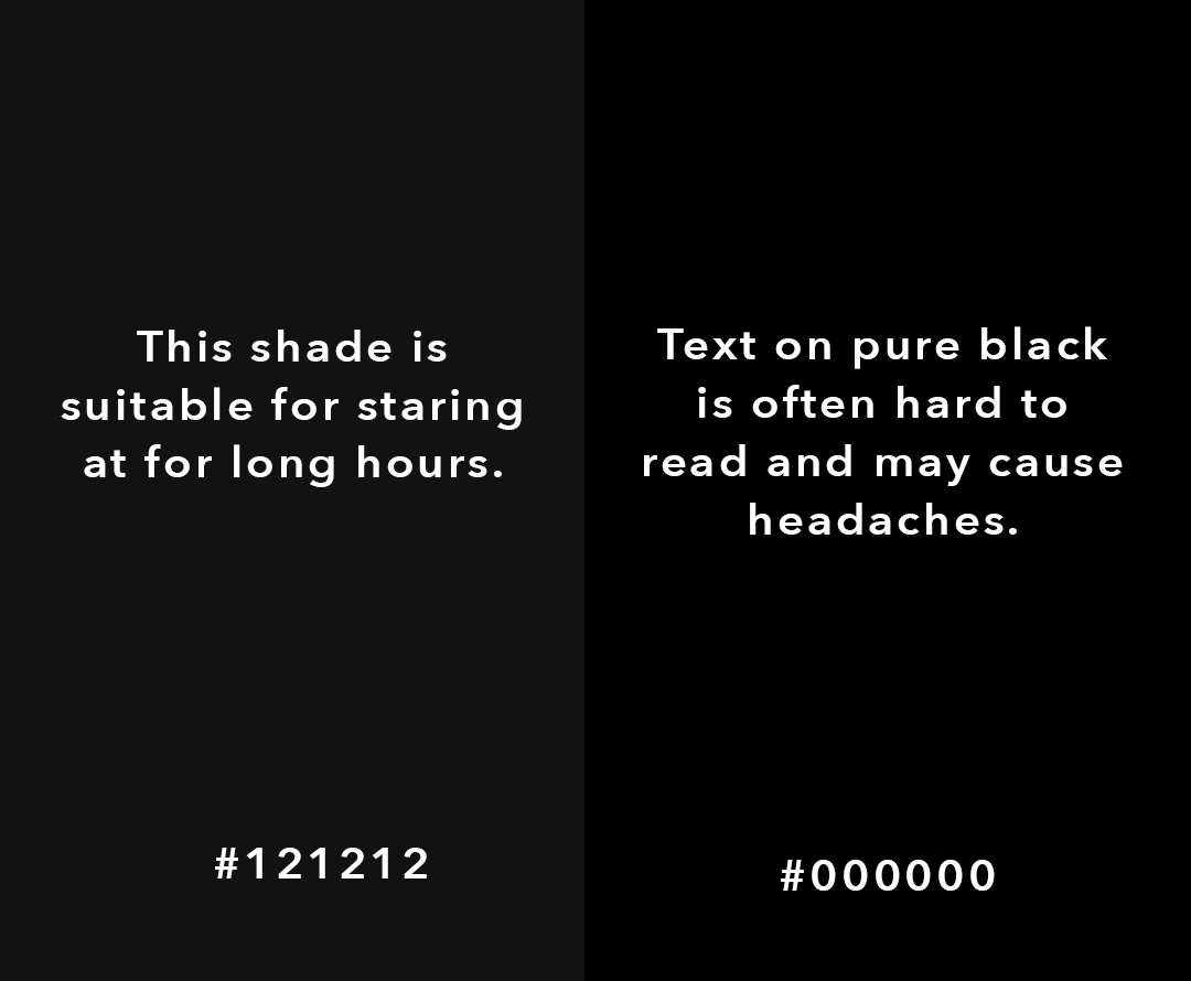
Notice how the right text looks bigger than the left one –– even though they’re the same size. Think of it as projecting farther out of the screen. But why?
It’s all about the contrast.
High contrast stands out more, but is harsh. Low contrast isn’t eye-catching and blends together, but is much easier on the eyes. It’s a zero sum game.
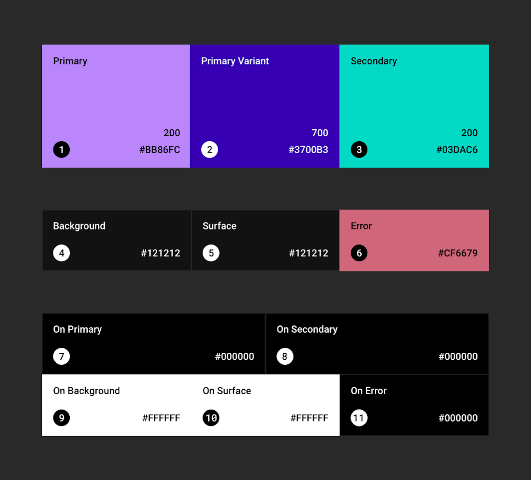
For me, the solution was to take my white mode colours and reduce saturation by around 40%. Here’s my palette.
How It Works#
The switcher wraps all the children passed in with a wrapper whose style is set with an !important. This overrides the children’s styles when dark mode is on.
The user can pass in props for HTML primitives (h1, h2, code…) along with a other selectors (background, default-text, code-background…) for specific cases. Those get passed down to the dark mode stylesheet, which incorporates them as necessary. I like this approach because of how scalable it is –– I can add props as I go.
The toggle is a checkbox input HTML primitive, with some fancy CSS over it. It’s onClick method triggers a change in state –– which stores what mode it currently is. A re-render happens with a new mode, and viola! We have a new palette.
You can install my darkmode or play with the demo or fork the github to make your own!